Finding Your Signature Style With The High Road Design


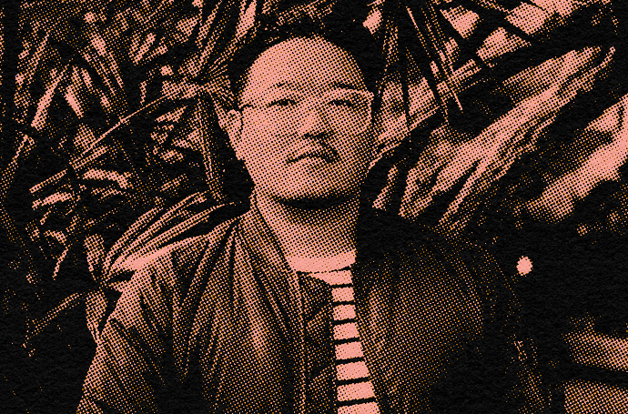
Howdy, My name is Jon Kutt, otherwise known as The High Road Design. I’m an Illustrator/Graphic Designer from Kitchener, Ontario, Canada, with an unhealthy addiction to drawing and posting humorous drawings on my instagram and working with some fantastic clients such as Netflix, Ernie Ball, Jimmy Kimmel and Naked and Famous Denim.
Notes on creation and ideation (or how I learned to love drawing and built an Instagram following while drawing testicles).
When I first started drawing in procreate it was nerve wracking. I was trying to kill two birds with one stone, learning new software with a new medium (iPad pro and Apple Pencil) and starting drawing again after a 20+ year hiatus. I had 25 years as a graphic designer and vector artist but drawing had come to a full stop after a failed year taking illustration in school.
“DRAWING HAD BECOME SCARY TO ME AND PUTTING PENCIL TO PAPER FILLED ME WITH AN EXISTENTIAL DREAD OF FAILURE AND SELF LOATHING.”

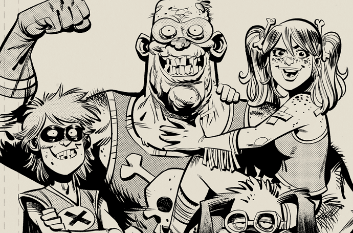
A selection of images from those early days around 2018, including one celebrating my 1,000th follower (now approaching 100,000).
I had to relearn how to approach drawing like a child, having fun and trying to put any or all ideas down on the page without fear of lack of skill or nuance. I decided the best way was to draw everyday and post on Instagram, which was also a source of much anxiety as I was struggling to find an audience and my art was not inspiring the reaction I was hoping for.
“I DECIDED THE BEST WAY WAS TO DRAW EVERYDAY AND POST ON INSTAGRAM”
Finding My Feet
It was a struggle at first, I hated my drawings and my ideas were forced and to be honest…I just wasn’t having fun. BUT the tools were there…procreate after an initial learning period, is such a joy to use and I had just purchased a set of tools that promised to give my art the look of the old comics I loved so much… True Grit’s Debaser Lo-Fi Comic Coloring Kit.

Debaser really opened up a new world of creativity for me.
Gradually I started to lose the inhibitions and just draw the shit that popped into my head and started to get better at drawing too. Debaser covered up the flaws and even made some of them seem intentional. Along the way I had developed my own creative formula that kept things very personal to me and was an endless well of stupid ideas for me to draw.
Inspiration Is Everywhere.
We all have favorite films, tv shows, books, artists and more that give us joy. Favorite t-shirts with obscure sayings our parents bought us when we were kids, weird signs we see while at a flea market, etc, etc.

Pop culture references? Hold my beer.
Coming up with an idea looks something like this… first I come up with something stupid to draw, it may be a character from a favorite movie or just a specific thing like if Robert Crumb drew an armadillo wearing a cowboy hat ( seriously… you can just get a weird category map and combine them together … famous artist+random animal+random action or accessory+famous quote from a movie… voila ART!).
Then I come up with a phrase that aligns (or doesn’t) and either typeset it in illustrator or draw it myself.

Remember, you can’t get too weird.
Alright, enough of this malarky, let’s get to the tutorial.
In this tutorial, I’ll start with some sketching, inking and finessing the art in Procreate ready to post on Instagram. Then shift over to Adobe Illustrator where we’ll vectorize the art, simplify the color palette and prepare my artwork to be printed on a t-shirt.
True Grit Tools & Apps Used:
✓ Debaser for Procreate
✓ Infinite Pulp
✓ The Rusty Nib for Procreate
✓ Hardwear
Analog Tools Used:
✓ Procreate
✓ Adobe Illustrator
✓ iPad Pro
Software skill level:
I'll be giving pointers on some of the technical stuff but if you know how to use the basic functions of Procreate and Illustrator you'll be able to follow along.

Part 1:
Sketching.
For this particular drawing my thought process was something like this…
- Starting idea: A werewolf
- Second idea: Have him dressed in overalls and striped shirt like the wolfman from my favorite show as a kid, Hilarious House of Frightenstein.
- Third idea: Have him carrying a toolbox and use the phrase “tools of the trade” to reference the True Grit brushes and effects I use in my work.
I work small… like 2048x2048 pix small, since most of my work starts as an Instagram post (and the fact that I don’t have unlimited space on my iPad). This gives me enough flexibility with size/ number of layers / speed of working and allows me to keep a ton of my art on my device so I can find them easily.

I usually start with a paper texture from Infinite Pulp, Debaser or KraftTone just to get a feel for how my artwork looks with it right from the start.

Generally my focal point is the central character but I do dabble with other elements early on as well. I sometimes make quick thumbnails but very often my finished piece is worlds apart from the original so I just use them to start thinking of all the elements that need to be included.
For this illustration, I wanted the pose and face pretty well locked-in before even thinking about type. Once I solidify the layout, I add rough lettering by drawing a solid shape that fills the space and carving out the words and letters super organically.

Part 2:
Inking.
I jump into inking quite early because I‘m impatient and want to work out shading and line quality in the ink phase. I usually use 3 ink comps before I start tightening up and work on final inks.
My all time favorite brush is the Mr Legit Brush (legacy) from The Rusty Nib set. I have no idea why the old version of this brush is my favorite but it really is so smooth to draw and gritty in texture. I’m also really digging the inkers from the KraftTone set. They’re super crisp with easy taper control.
As you can see in the video below, my inking really develops over the course of 3 comps as I add detail and experiment. The lesson here is that you don’t need to get it right on the first pass. There’s plenty of time to refine the details along the way.
Part 3:
Coloring with Debaser.
I’m going to show you how I color my work using Debaser which I use on almost all of my work give it a nice vintage comic aesthetic.
Using Debaser.
As I mentioned earlier, discovering Debaser was a real turning point for my process, giving my work a nice vintage comic aesthetic with plenty of room to add my own flavor.
The Debaser kit uses a library of pre-mixed color halftone textures that can be imported into your artwork and used to fill your illustration using layer masks. You can do this using a brush to “paint” the textures in or (my favorite) using a reference layer and color drop. If you haven’t used reference layers before let me tell you… it’s a game changer.
Because I like to think ahead, I created a simplified version of my line art during the inking process… just the outlines with no fills or fine shading details.

I set this layer as a reference layer (see above) then place my Debaser colors into my canvas and create an inverted layer mask.
Finally all I need to do is drag and drop white into the mask using Color Drop and it will honor the boundaries of the reference layer.
Sounds complicated but check out how easy this process is in the video below.
Making The Foreground Pop.
At this point I’m feeling the heavy dark background is a little bit much and I want Wolfie to really pop. It’s a good thing I like to keep my layers in check because now I can use the background layer as a clipping mask and fill it with one of my Debaser colors to fade it back a little.

Part 4:
Vectorizing for t-shirt printing.
Now to get this drawing into vector format. Why vector you may ask? I personally like the flexibility vector brings with simple flat color and the ability to change colors quickly and rescale without the size limitations of raster formats (jpg, png, psd etc).
A lot of my artwork from Instagram ends up as a T-shirt on my Threadless store. Sometimes I’ll make modifications from the social media file, whether that be layout shifts or simplification of art work to better suit a t-shirt print (paper texture effects don’t translate well to garment printing).
Export from Procreate.
To start the vectoring process I output both the simple line layer and the more complex black line art layer as tif files, airdropping them to my computer.
Once on the computer I create a new Ai file and place both images on separate layers. Then I use a heavily modified live trace on both layers made easier if using the settings given in the Hardwear Vector Distressing Kit. Illustrators default settings are far too simple and the maxed out version is too complex, but the Hardwear settings are just right. I uncheck ignore white because I want the white areas of my artwork to be vectorized as well so I can fill them with color later.
(There are (paid) alternatives to livetrace too the best being Vector Magic which outputs a superior clean vector file with zero of the shifting that is always an issue with livetrace.)

Now it comes down to picking colors. I use global swatches (when creating a new swatch make sure global color is ticked) to simplify swapping out colors later on. Generally I keep it between 3-4 colors to keep costs low and retain a more graphic look. Delete the black from the traced simplified layer and use it to block in color. Once you get the color portioning done it’s super easy to duplicate the artboard and try multiple color combos By either choosing new colors or recoloring using the edit/color color wheel.
I’m keeping this graphic fairly clean, but if you wish to add further texture in Illustrator, the graphic styles and speckle brushes included in the Hardwear kit truly do a great job. The opportunities are endless.

So there we go… art prepared for screen and apparel, served up in 2 separate formats.
I really hope you learned something new and thanks for following along!
More about The High Road Design
Website | Instagram
Featured music: Blue Hills by Yellowbase